Project Introduction
Every great designer starts with the basics. Before you can build fancy logos, flashy animations, or killer websites, you need to understand the core principles of design that make visuals work. This project is your first big step into design awareness: you’ll create a presentation that explains and demonstrates foundational design concepts from Robin Williams’ The Non-Designer’s Design Book.
You’ll be building this in Google Slides, and here’s the kicker — no random internet pictures. Everything you create must use shapes, text, and color only. That means your designs have to carry the message without leaning on photography. Why? Because in the real world, designers often have to make big impact with very limited elements (think branding, iconography, or UX/UI work). This is your first challenge in thinking like a pro.
- Don’t just explain the principle — show it. Make each slide a mini-demo of the concept you are explaining. For example:
- A color slide with bold palette choices that feel intentional.
- A typography slide showing type hierarchy in action.
- A white space slide that proves “less is more.”
- A final reflection that wraps it all up in a single sentence of insight.
Creative Focus
This project is all about proving that simplicity is powerful. Each design principle you cover might sound basic, but when applied correctly, it completely changes how a viewer experiences your work. You’ll create slides that not only explain the principles but show them in action.
Want to demonstrate contrast? Pair bold black text with a bright yellow background. Repetition? Build a slide where patterns reinforce the message. Alignment? Line everything up so it feels clean, intentional, and professional. White space? Let your content breathe so it feels modern and focused.
By the end, you’ll understand how these principles control readability, hierarchy, and impact. These are skills you’ll use every single time you make a poster, design a website, or lay out a magazine spread. Spoiler: they’re also the same skills employers look for when deciding if a designer “gets it” or not.
Why One Sentence Per Slide?
Here’s the deal: your slides are not a script, and your audience isn’t here to read a novel. Slides are there to support you, the presenter — not replace you. If you cram paragraphs of text onto your slides, two things happen: your audience stops listening and they start reading instead, or worse, they give up completely.
That’s called Death by PowerPoint, and it’s the fastest way to lose an audience. The golden rule is simple: one sentence per slide. That sentence should be punchy, memorable, and visually clear. It’s not the whole story, just the spark. The audience should be looking at your clean, bold slide while listening to you explain the details.
Remember — if people are trying to read and listen at the same time, they’ll fail at both. Your job is to make a presentation that feels alive: a gorgeous visual on the screen, and your voice guiding the meaning behind it. That balance is what makes professional presentations stand out.
Project Requirements
Your final submission must include a 10-slide Google Slides presentation, and a properly formatted WordPress Project Post that showcases your work.
- Final Deliverable:
- A 9-slide Google Slides presentation.
- Each slide contains exactly one short, intentional sentence.
- Visuals created with shapes, color, and typography — no outside images allowed.
- Slide Structure:
- Title Slide – with your name and project title
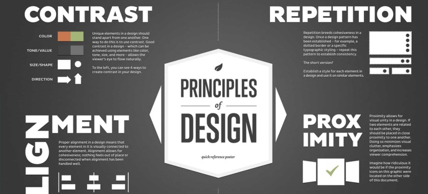
- Color
- Typography
- Contrast
- Repetition
- Alignment
- Proximity
- Layout Balance
- White Space
- Final Slide – one-sentence reflection on what you learned
- WordPress Portfolio Requirements:
- Embed the finished Google Slides presentation in your portfolio using the Embed Code and Custom HTML block in WordPress.
- At least 1 Project Type selected.
- Add 5–10 Tags (examples: design principles, CRAP, color, typography, white space, layout balance, Google Slides, portfolio project).
- Create a unique Featured Image (not just a screenshot of a slide, have some fun with this).
- Write a project explanation (250–350 words) that covers the project.
Project Grading Rubric
| Criteria | Description | Points |
|---|---|---|
| Slide Content | 10 slides total, each with one short, clear sentence. | 15 pts |
| Visual Demonstration | Each design principle is explained and shown through shapes, text, and color. | 15 pts |
| Design Principles | Strong evidence of contrast, repetition, alignment, proximity, balance, and white space. | 20 pts |
| Portfolio Integration | Properly embedded in WordPress with tags, featured image, and written explanation. | 20 pts |
| Professionalism | Clean formatting, consistent style, polished slides. | 20 pts |
| Communication | Slides clearly convey principles in a way that’s easy for others to understand. | 10 pts |
| Total | 100 pts |
OCP & Standard Alignments
01.06 – Use appropriate communication skills to interact effectively with others. …because you’re learning to explain design visually and verbally with clarity.
02.01 – Apply knowledge of design elements and principles. …because this project demonstrates mastery of multiple design principles.
02.04 – Demonstrate knowledge of composition. …because layout, balance, and spacing define how your slides read.
04.01 – Use multimedia terminology and concepts to create presentations. …because you’ll apply correct vocabulary and show your understanding through design.
04.03 – Create a digital portfolio to showcase multimedia projects. …because the finished deck is published on WordPress.
05.01 – Demonstrate proficiency in advanced design. …because applying design principles consistently is what separates beginners from pros.
