The Not-So-Serious Survival Guide to Typography
Because fonts are basically the socks of the design world—mismatch them, and someone will judge you (probably me).
Let’s face it: typography can feel like trying to herd cats while reciting the alphabet backward. But fear not, brave newbie! This guide will help you navigate font forests, dodge Comic Sans-shaped disasters (more on that later), and emerge victorious. Buckle up—it’s gonna be italic fun. I’ll break it down into more easily understandable groups.
First… a cautionary tale…

Let’s face it: typography can feel like trying to herd cats while reciting the alphabet backward. But fear not, brave design padawan! This guide will help you navigate font forests, dodge Comic Sans-shaped landmines, and emerge victorious. Buckle up—it’s gonna be italic fun.
Font Types: A Zoo of Letters
Serif fonts, like Times New Roman or Georgia, are the fancy uncles of typography. They wear little decorative hats (called serifs) on their letters and thrive in formal settings—think resumes, academic papers, or invitations to events where people drink tea with their pinkies up. Sans serif fonts, such as Helvetica or Arial, are their minimalist cousins. Stripped of serifs, they’re the go-to choice for modern designs, websites, and anything that needs to whisper “I’m tech-savvy” without trying too hard.
Script fonts, like Lobster or Brush Script, are the drama club dropouts of the font world. They swish and swoosh like they’re auditioning for Cursive: The Musical, making them perfect for wedding invites or logos that want to feel fancy but not pretentious. Just don’t use them for more than a few words, or they’ll turn into unreadable spaghetti. Display fonts, such as Bebas Neue or Impact, are the neon signs of typography—loud, flashy, and best used sparingly. They’re ideal for posters, social media quotes, or any situation where subtlety is as welcome as a kazoo in a library.
Monospace fonts, like Courier New or Roboto Mono, are the nerdy cousins. Every letter gets equal space, like a communist utopia for alphabets. They’re perfect for coding tutorials, retro designs, or any project that wants to channel 1980s hacker vibes. Slab serifs, such as Rockwell or Clarendon, are the beefcake bodybuilders of the font family. With thick, block-like serifs, they’re built for headlines that need to flex, like “BIG NEWS: I ate cereal today.”
Handwritten fonts, like Comic Sans or Caveat, are the overly enthusiastic texters of typography. Casual and quirky, they work best for informal projects—think kids’ party invites or a café chalkboard menu. Just be warned: using Comic Sans in a corporate report is like showing up to a job interview in pajamas.
Typography Tips That Won’t Put You to Sleep
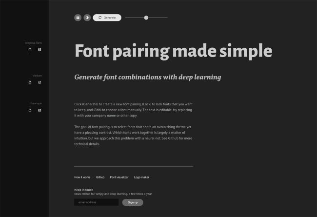
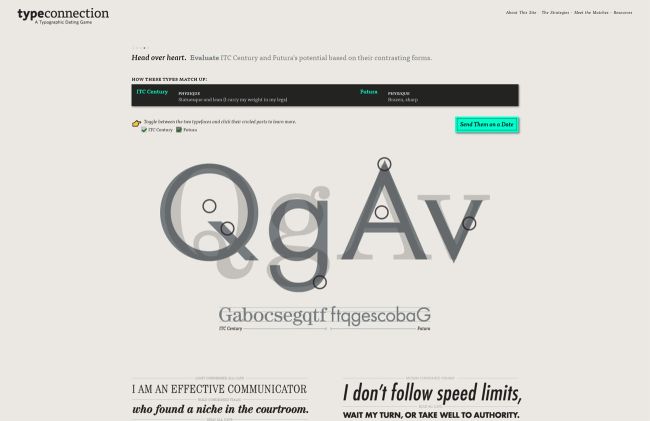
Font pairing is like casting a buddy cop movie—opposites attract. Pair a stern serif (like Times New Roman) with a chill sans serif (like Arial) for visual harmony. Tools like Canva’s Font Pairing Generator can do the heavy lifting if you’re feeling lazy. Headers and subheaders should have a clear sibling rivalry: headers are the loud older sibling (go big, bold, and maybe all caps), while subheaders are the eye-rolling younger one (smaller, lighter, but still important).
Readability is non-negotiable. Sans serifs like Open Sans or Roboto are your best friends for body text, especially on screens. Keep font sizes at 16px or larger unless you want readers squinting like they’re deciphering ancient hieroglyphics. Start simple—practice with basic system fonts like Arial or Georgia to learn spacing and alignment. Once you’ve got the hang of it, raid Google Fonts like it’s a Black Friday sale.
How to Install Fonts on Windows (Without Crying)
Finding fonts is the easy part. Free gems await at Google Fonts or DaFont, while premium options lurk on Adobe Fonts or MyFonts. Downloading fonts often leads to ZIP files—those digital Russian nesting dolls. Right-click the ZIP file, select “Extract All,” and hunt for the .ttf or .otf files inside. If Windows throws a tantrum, tools like 7-Zip can help. To install, right-click the font file and hit “Install,” or drag it into the Fonts folder (found in Control Panel > Appearance > Fonts, aka digital Narnia). Manage your growing font hoard with Windows Font Manager, but let’s be real—you’ll never delete any.