Project Introduction
So now we are past the point of Mood Boards and Identity Graphics, it’s time to put our new direction to work for real! Last week, you watched a video by Sean Adams called Branding for Designers, in which we learned about the different styles of what a client would call “logos”. This week, will will focus in on Wordmarks and Monograms, and give our client a few options to look at and pick from. We will be using these terms, since that is how they were presented to us in the Lynda videos last week.
Without a doubt, this project will be challenging to anyone who is brand new to this field, but the idea of using typography only to work on a finalized logo is a very strong step in the right direction. This project is designed to make you work within the bounds of your previous branding work, but also a great time to explore more options to show the client at the end of the week. Remember, as a designer it is your job to balance wants and needs for each and every project, and this next design project is great practice doing just that.
“The entire point of this process in to showcase your own ability to listen to what the client wants, and still give them what they need. This part of the process can absolutely be grueling, so buckle up.” – GD
Sample Set of Wordmark & Monogram Designs
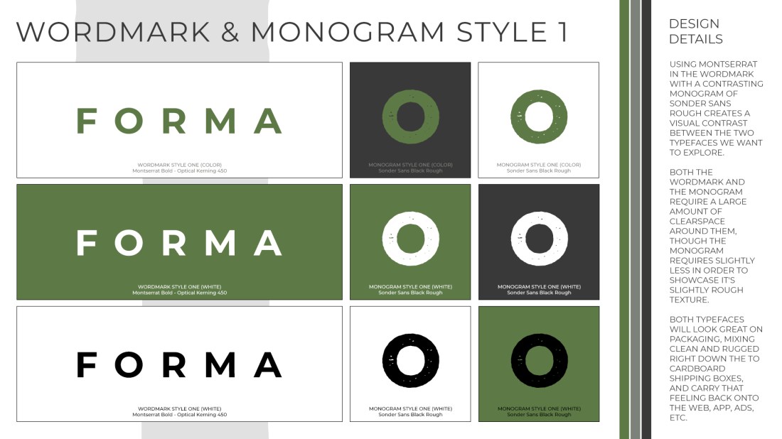
As you can see, I have made the BARE MINIMUM three versions of the Wordmark & Monogram for my sample company. I used the second set of Identity Graphics from last week (with the Sage Brush, Mossy Mist and Grey Slate colors, as if that was the direction my client wanted me to go in). Obviously, you will use the one that YOUR client chose. I have done a good enough job to warrant about an 75%-85% grade based on the rubric below, but the basics are all there. I paid close attention to give the Wordmarks & Monograms clearspace as well as color variations, and made sure they were consistent with what the client ask for in the Design Brief. I could have done much better by adding images to put the various design on, and used some of the blend modes decided from the last project.


Project Requirements & Helpful Links
- At a minimum, you will submit three designs for review by the client/class. Each design should include:
- 1 Wordmark & Matching Monogram, with three variations (Color, Black, and White).
- A good logo needs to appear on lots of different backgrounds, so we need to consider that modular function from the very start of our process.
- Some (hopefully) Useful Links:
- Websites like Wordmark.it can be super helpful to get your brain going in a creative direction. I personally don’t use this, but some students find it very helpful, so make up your own mind with some testing.
- This article titled Logo Design 101: The Wordmark is complete with examples and workflows, for some great creative food for thought. It’s worth the 5 minute read, for sure.
- You should re-watch Branding for Designers, Section 4 if you would like to see another example of a possible workflow.
- 1 Wordmark & Matching Monogram, with three variations (Color, Black, and White).
- Graphics will be 1920x1080px, 72dpi JPGS.
- The images will be uploaded to your Portfolio as individual images (like above) for your presentation, able to open “full screen” to see them in full resolution on the screen or projector.
- Once again, this project will be based upon what the client wants, and what they need. It really is 90% of what we as designers do… so keep that in mind.
Project Grading Rubric
The final grade for this project will showcase your ability to hear what the client wants, and give it to them alongside with what they need. The design and layout of the Wordmark & Monogram Graphics will also be part of the grade for this project, since by now you should have a strong grasp on things like clearspace, repetition, color use and typography. Lastly, your skill with Photoshop will be clearly displayed based on your ability to manipulate the tools available to you to make stunning and impressive graphics.
| AMAZING 90-100 |
GREAT 80-89 |
GOOD 70-79 |
SUB PAR 60-69 |
POOR <60 |
| Honestly, are you a student or are you only pretending to be one? Your work was absolutely on par with professional work in the field. | Your work was strong, and you have the skills. However, one aspect of the project was off, or didn’t work as well as you intended, or wasn’t overly creative. | You did the basic job, but didn’t do an outstanding job. The graphics were acceptable, but not quite what the client requested. | Student followed directions, but provided poor examples of what the client wanted, or did a poor job using the software. | Student did not follow directions, didn’t demonstrate proper use of the tools, or did not give the client what they wanted at all. |
